1997 – on Seductiveness of Nostalgia

My family, coloured pencil on paper, 1994

NHL-cards and Extreme Ghostbusters… that pretty much sums up the year 1997 for me.

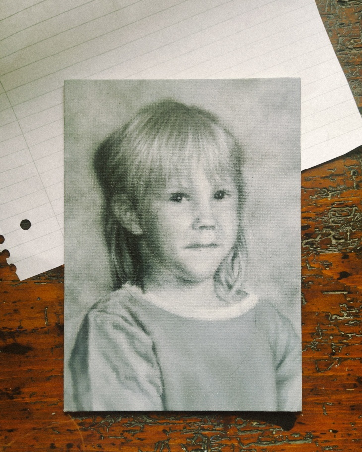
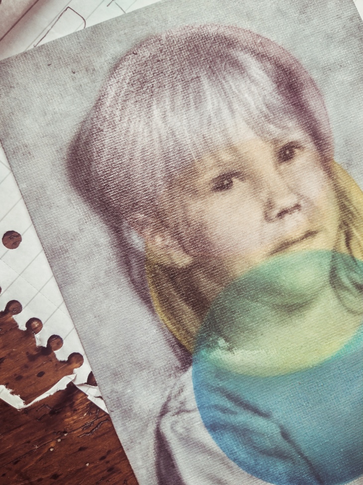
Although Nokia was already in the process of forging their mobile-millions in 1997, Finland was far from being the tech-savvy start-up capital of the world it is known as today.  In fact, most people were barely back on their feet following the early 1990’s depression and the subsequent collapse of the Finnish economy.  Between 1992 and 1997 unemployment had hovered between 12-17%, but things were looking up.  Not insignificantly, our boys took home gold at the 1995 Ice Hockey World Championship Games, hoisting the nation’s collective self-esteem to an all-time high.  On a more personal level, I started school a few days short of my seventh birthday in August of 1997, rocking a blond mullet and clothes sewn by my mother, with dreams of being an artist one day.  We were a few years short of moving out of the council flat I was born in, shopping was paid in Finnmarks, calls made on GSM and you needed to wait two weeks for your selfies to be developed and delivered to your door.

"1997" by Tiina Lilja, work in progress

Time works in strange ways during those early years of your lives.  Indian summers and white Christmases; the full Monty.  Most people remember but an idealised version of their formative years.  I certainly wasn’t aware of the archaic economic and socio-political structures unravelling around me.  For a child such as myself growing up in a sleepy regional town in the South West of Finland, the winds of change blowing through my small nation were easily drowned out by the gentle sway of its ancient forests.  Kids are like that I suppose, adaptable.  My dad was home a lot when I was small and I loved it.  It took me years to figure out he’d been on furlough or had lost yet again another job alongside tens of thousands of young men like him.  The average unemployment figure might have been around 15% in 1994, but for builders like my dad, it was over 36%.

So much for the good old days.

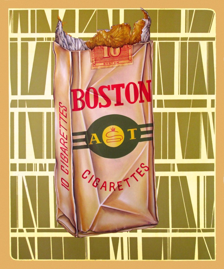
Why is it then that we turn to nostalgia when times are hard?  Is it really a coincidence that Christian Dior struck gold with his “New Look” featuring ultra-feminine, conservative looks reminiscent of La Belle Époque in 1947?  Just ask George Taylor, he introduced us to the Hemline Index as far back as in 1926.  For the lockdown season of 2020, whether you are shopping at Primani or Prada, there’s a new look in town:  Long floral dresses and puff sleeves.  Comfortingly feminine, non-threatening – nostalgic.  And it’s not just the fashion you need to look out for.  Retro has been big news in graphic design for some time now, but when the big multinationals like Unilever or Nestle’ whip out their heritage packaging, buckle up Bucky you’re in for a ride.  A sure way to spot the economy is in the toilet is knowing you are being tempted to buy biscuits by enrobing them in the warm fuzzy happiness of nostalgia.

"1997" by Tiina Lilja, 2020, oil on board - work in progress
“1997” by Tiina Lilja, 2020, oil on board – work in progress

I am not saying nostalgia is inherently bad for you.  It is, however, incredibly seductive to remember only an idealised, simpler version of the past.  Jamie Windsor talks about the problems of nostalgia in much more elegant terms in his video essay simply titled “Avoiding Nostalgia”.  This yearning to recall an ideal past void of modern evils is a powerful marketing tool and harnessed so sell us things as well as influence our political decisions.  “Make America Great Again”, remember.

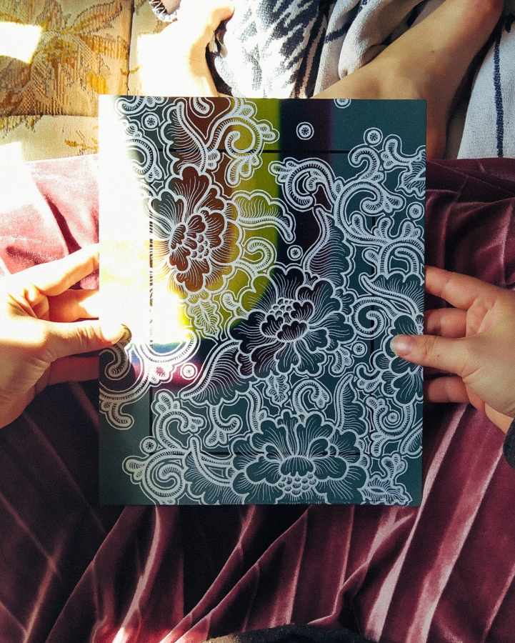
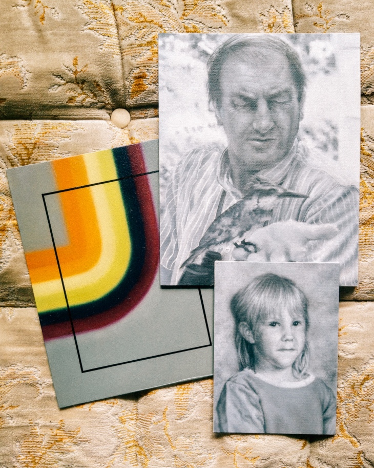
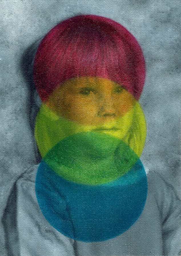
The art I have been making lately is riddled with nostalgia, but I did not set out to paint nostalgic imagery just to introduce you to my mullet, circa 1997.  People do not yearn for simpler, happier times in a vacuum.  I am talking about the mother of all nostalgia, the cardinal reason why we so crave that idealised past: fear.  Fear of uncertainty, fear of change and fear for what the future will hold.  He has been my constant companion in the studio for these past few months.

"1997" by Tiina Lilja (2020) oil on board
“1997” by Tiina Lilja (2020) oil on board

No filter more powerful is yet invented as that of the perspective of a child.  Somewhere between the Pogs and Dr. Bombay, I do remember the recession of my childhood: from the bread-ques (the Finnish expression for foodbanks) hand-me-downs and the evictions.  I suppose those were the things my parents would have called the new normal at the time.  It must have been a balancing act of royal proportions, but they pulled it off.  Out of many wants and withouts, we always had a roof above us, food and each other.  Although it took me years to stop feeling inferior in the company of those more affluent, I started school in the August of 1997 confident in my ability to achieve anything my heart may desire and largely unafraid.  A sparkling new cog eager to take their place in a machine being built on top of the old.  The fear of uncertainty, rejection and loss crept in much later, alongside the responsibilities of an adult and a need to find my place in this world.

As a painter, I need to make sense of my surroundings through the images I create.  If ever there was a constant I wish to cling on to when our world has turned upside down, it is art.  And I hope the art I am making gives even a fraction of the solace it has awarded me, to you and others stuck in the twilight zone of the new normal.

Keep calm and create,

Tx

Pumpuli Enkeli

Can I withhold pay if my studio assistant refuses to social-distance himself?

My studio assistance refuses to social distance himself.

Greetings from the atelier floor – I’ve got something to show to you and I swear it is more than just adorable photos of my dog.  The rainbow-hued mixed media piece that cropped up on this blog last week is finally finished.  Now named “Pumpuli Enkeli”, it started out as a simple test in blending, on a slightly defective canvas panel.  It is quite rare that I have time to experiment beyond doodling on the pages of my sketchbook, so this has been a real treat.

Long story short: I wanted to see if it would be possible to use acrylic paint markers on top of an oil painting.  Usually you’d expect some rejection, but it has turned out much better than first predicted.  I used spray-on picture varnish as a blocker between the oil-painted basecoat before adding the line work using acrylic paint markers.  A few days later, further two coats of picture varnish were added to protect the finished surface and give this artwork an even sheen.

Only time will tell how it will age, but so far so good.

colourful calico painting by Tiina Lilja

I have been drawing a lot of floral patterns lately, inspired by one of my favourite books: Owen Jones’ the Grammar of Ornament as well as his the Grammar of Chinese Ornament.  Yet it wasn’t Mr. Jones who turned me into a connoisseur of printed cottons.  I grew up in a historic textile town of Forssa, in the South West of Finland, so you could say the love of pattern is in my blood.  The name Pumpuli Enkeli translates as the Cotton Angel – a nickname of the factory girls of Forssa who worked in the Finlayson textile mills.  This is the official version anyway, sanitised by the passage of time.  Some old beards who worked down at the mill as lads in the beginning of the 20th century, however, recalled a cruder alternative in a documentary I saw years ago: Cotton C*nts.

Fair enough.

Angels or not, this painting is my tribute to those largely nameless girls and women who shaped Forssa into The City of Colourful Cloth.

The history of my hometown has inspired me to a great extent and I cannot deny the influence Finnish design has had on my work.  There are many artists and designers I feel indebted to, with special thanks given to Aini Vaari, who drew patterns for Finlayson in the 1950’s and 60’s.  My painting “1958”, featuring her Coronna-design as a background motif, continues to be one of my own favourites.

At the time I was obsessed about mid-century Americana in Scandinavian graphic design, such as the Boston cigarettes pack featured in my painting.  It is modelled on a real pack of fags given to me by my builder dad, who had found it under a floor on one of his job sites.  Either left behind by accident in the late 50’s or placed there to amuse renovators of the future, the dinky cigarette case was all crinkled up, but as vibrant in colour as on the day it was printed.

"1958"

Oddly enough, the other paintings I am currently working on, too, remind me of home.  Most of these pocket sized portraits feature my immediate family back in Finland.  Although I have lived overseas for ten years and a bit, it is this pandemic that makes me feel light years away from them.  Tracing the likeness of my dad or my wee sister makes me feel that little bit closer to them when the world seems to be going down the toilet.

But enough of that negativity already.  I should be back at my 9-5 in a few weeks’ time, fingers crossed, and in the meantime I have a studio full of paintings to finish.

So happy painting!

Tx

Work in Progress

I don’t know about you, but I am really struggling to get anything finished these days.

So, in the spirit of keeping calm and carrying on, I thought I’d give you a few work-in progress-snaps.  Y’know, in case you too are browsing the underbelly of internet rather than getting back to work.  I would know… after all, I am writing this to actively avoid getting any painting done.

Lots of little paintings needing to be finished in my studio

As you can see, my little family of portraits is steadily growing and I do promise to get on with it all.

Tomorrow, maybe.

In general, I do find working on multiple paintings pretty useful.  Mainly, as it stops me from getting bored of my own work.  Also, when using oil paints, this will give you something dry enough to paint on each day.  That is the theory anyway.  Right now I have a studio full of little paintings, like a closet full of clothes and nothing to wear.

The latest additions are my wee sister (left) and me (right), captured around 1996-1997 or so, and my husband’s dad (centre).  I never got to meet John, which makes rendering a likeness quite difficult, but we are getting there.  Painting a portrait from a photograph alone can be a bit tricky, but luckily I have my hubby to guide me through it.  As silly as it sounds, sometimes you can paint the most perfect copy of a photograph, yet as a portrait it looks nothing like the person photographed.  This wasn’t a problem when I was painting my dad, for example, as I know his features better than my own.  I loved being able to spot any rogue brush strokes immediately, but here I am not quite so sure of myself.

We’ll just going to have to wait and see how this portrait develops.

The other thing I’ve been working on is the vibrant rainbow swirl pictured above.  It started out as a colour test for another project, really, but could mature into a piece of its own.  I am currently waiting for the paint to dry on this one so I could start adding new elements on top of the oil painted base-layer.

So stay tuned – how long can it take to find inspiration locked in a small cottage in the middle of a pandemic?  Right!?

Oh, and allow me to toot my own horn a bit.  If you fancy more of these work in progress type of posts, head over to my Instagram;  you’ll get your fix there.

Cheerio.

Tx

Nothing but a Hound Dog – digital illustration

Greeting from lockdown guys – things have not quite reached the banana bread-stage of cabin craziness, but we’re almost there.  In avoidance of baked goods, I thought it would be nice to brush up my Photoshop skills and add new digital work on my illustration portfolio.

Now, I’ve used Photoshop in the past to work out packaging concepts and edit other work, including finishing off hand-drawn illustrations, but always steered away from making creative work completely digitally.  There’s nothing too dramatic behind my Adobe antipathy: I find making digital images less interesting than drawing by hand, partly because of my limited skillset in rendering illustrations to the standard I expect from my other creative work.

big dog illustration by Tiina Lilja

I once had a teacher who told me the biggest back-handed compliment you could throw on a calligrapher was to say their work looks just like it has been printed.  Fifteen-odd years later, her way of thinking still affects the way I assess my own design work.  Whether hand-drawn or not, the greatest value I can add to a piece of work is my handwriting: my personal style or approach, a wee touch of humanity, if you will.  When it comes to digital media, illustration in particular, I appreciate work that does not reveal its origins too easily.

Do not be fooled into thinking this means I despise digital means of creating imagery, on the contrary – I find it sort of magical.  Like good painting or a drawing, a good digital illustration carries a mark of its maker.  And do I think conveying a sense of individuality through the artists’ handwriting is more difficult to achieve digitally than simply by pressing a pencil against a half-decent sheet of Fabriano.

cavalier king Charles spaniel illustration by Tiina Lilja This one was inspired by Staffordshire dog statues.

This is really what I have been practising recently – adding to my digital illustrations that little je ne sais quoi.  I chose to go about it roughly the same way that I began developing my style of painting, about a thousand years ago now: by copying other artists’ work, studying their methods of image making and listening to helpful advice from my seniors.  Thankfully, did not need to start tracing over Guernica from the pages of an art directory, technology has moved on a fair bit since the late nineties, and I simply watched helpful tutorials from YouTube, most notably from Retro Supply & Co.

A shout-out to these guys, they are great.

When it comes to learning, imitation really is a form of flattery.  It is pretty much the same as cooking industrial quantities of Nigella’s scrumptious banana bread until you develop a recipe of your own.  The process takes time and you are sure to find yourself in that awkward half-stage where your work is strongly influenced by a style or a trend yet undeniably yours.  Some of my early paintings are heavily influenced by the work of the Nordic symbolists such as Akseli Gallen-Kallela and the Pre-Raphaelite movement – does that make those canvasses any less my own in your view?

german shephard / Alsatian illustration by Tiina Lilja

Returning to these illustrations I have been making:  As you can see, they are all dogs, mostly my own good-boy, Rusty.  Some are based on drawings from my sketchbook, others put together completely on screen and each finished to look like vintage prints.  It is a style I have been admiring from afar, thus it felt like an approachable starting point.

For the tech curious, I use Photoshop to make my illustrations, using a stylus on a touch screen rather than a graphics tablet.  As a painter, that pen-on-paper illusion genuinely helps me to bridge the gap between what I can achieve on paper and on screen.

I do hope you have enjoyed this interlude to view my illustrations.  If nothing else, it feels great to be confident enough on my digital work that I can publicise it to you here.  My side-hustling days as a freelance designer have been put to rest for a bit since I began working as a studio painter, but maybe this is something I should write about more.  The rift between arts and design is frankly ridiculous and I am tired of feeling like my design work is some sort of a dirty secret when exhibiting fine art and vice versa.  There are ultra-talented people working on both sides of the fence and we would be better off talking to each other more.

Tiina x

Two Brides

I have written a bit about the Two Brides before, first focussing on the element of painting a figurative portrait with the aid of photography and latterly to discuss the concept of failure as a creative practitioner.  This time, however, the piece is no longer a work in progress: I have indeed finished my first portrait of persons in nearly seven years.

Two Brides, painting by Tiina Lilja, oil on canvas (2019)

If you are a regular reader of my wee blog or you found yourself here via Instagram, I imagine you to be pretty familiar with Two Brides already.  I sketched out the foundations for this artwork in January 2019 and having moved house and struggled with achieving what I considered a good enough likeness, I worked on it in little bits until I was happy with the costumes, background and, of course, the identifying features of the faces and hands of my two subjects.  This one is a fairly classical composition, drawing heavily on the look of the 1930’s studio photography this piece was directly drawn from.  Inspired loosely by the drawing Three Brides by Jan Toorop, a Dutch-Javanese symbolist, and the zeitgeist of the period between the two world wars, Two Brides was an interesting piece to execute from start to finish.

de-drie-bruiden-jan-toorop-53113-copyright-kroller-muller-museum.jpg
Three Brides by Jan Toorop via Kröller-Müller Museum

I feel any deeper analysis of my own work would be pure hubris, so this is where I will leave you, with my favourite work-in-progress shots of this painting and a promise to get back to you soon with news of new work!

P.S. Oh yes, and here’s a wee bonus: Seems like the Snapchat genderswap-filter does work on paintings too!  I hope you find these as funny as I do…

Voilà. 

T xxx