In other words, I find myself getting anxious about the silliest things and constantly second guessing the value of my work.
During these times of increased levels of existential dread, I put on Bob Ross and binge the Joy of Painting or find other suitably relaxing content on You Tube. Others meditate or run marathons, but i prefer to watch something mindlessly satisfying on a small screen while I sketch.
On the off-chance you too might be looking for absolutely non-Covid-19 related content to calm yourself down, I decided to create some strangely satisfying doodling-videos of my own.
So, follow my process of sketching out a geometric line drawing or a bohemian gypsy-rose. Grab a pen and paper of your own and draw with me, or simply let the hypnotic line-work lull you to a better place where the pubs are open and your mother-in-law is allowed to visit.* Either way, hope you enjoy my humble contribution to the slow television corner of the internet.
*Or maybe not, depending on the mother in law – mine is dead nice, though.
Greeting from lockdown guys – things have not quite reached the banana bread-stage of cabin craziness, but we’re almost there. In avoidance of baked goods, I thought it would be nice to brush up my Photoshop skills and add new digital work on my illustration portfolio.
Now, I’ve used Photoshop in the past to work out packaging concepts and edit other work, including finishing off hand-drawn illustrations, but always steered away from making creative work completely digitally. There’s nothing too dramatic behind my Adobe antipathy: I find making digital images less interesting than drawing by hand, partly because of my limited skillset in rendering illustrations to the standard I expect from my other creative work.
I once had a teacher who told me the biggest back-handed compliment you could throw on a calligrapher was to say their work looks just like it has been printed. Fifteen-odd years later, her way of thinking still affects the way I assess my own design work. Whether hand-drawn or not, the greatest value I can add to a piece of work is my handwriting: my personal style or approach, a wee touch of humanity, if you will. When it comes to digital media, illustration in particular, I appreciate work that does not reveal its origins too easily.
Do not be fooled into thinking this means I despise digital means of creating imagery, on the contrary – I find it sort of magical. Like good painting or a drawing, a good digital illustration carries a mark of its maker. And do I think conveying a sense of individuality through the artists’ handwriting is more difficult to achieve digitally than simply by pressing a pencil against a half-decent sheet of Fabriano.
This is really what I have been practising recently – adding to my digital illustrations that little je ne sais quoi. I chose to go about it roughly the same way that I began developing my style of painting, about a thousand years ago now: by copying other artists’ work, studying their methods of image making and listening to helpful advice from my seniors. Thankfully, did not need to start tracing over Guernica from the pages of an art directory, technology has moved on a fair bit since the late nineties, and I simply watched helpful tutorials from YouTube, most notably from Retro Supply & Co.
A shout-out to these guys, they are great.
When it comes to learning, imitation really is a form of flattery. It is pretty much the same as cooking industrial quantities of Nigella’s scrumptious banana bread until you develop a recipe of your own. The process takes time and you are sure to find yourself in that awkward half-stage where your work is strongly influenced by a style or a trend yet undeniably yours. Some of my early paintings are heavily influenced by the work of the Nordic symbolists such as Akseli Gallen-Kallela and the Pre-Raphaelite movement – does that make those canvasses any less my own in your view?
Returning to these illustrations I have been making: As you can see, they are all dogs, mostly my own good-boy, Rusty. Some are based on drawings from my sketchbook, others put together completely on screen and each finished to look like vintage prints. It is a style I have been admiring from afar, thus it felt like an approachable starting point.
For the tech curious, I use Photoshop to make my illustrations, using a stylus on a touch screen rather than a graphics tablet. As a painter, that pen-on-paper illusion genuinely helps me to bridge the gap between what I can achieve on paper and on screen.
I do hope you have enjoyed this interlude to view my illustrations. If nothing else, it feels great to be confident enough on my digital work that I can publicise it to you here. My side-hustling days as a freelance designer have been put to rest for a bit since I began working as a studio painter, but maybe this is something I should write about more. The rift between arts and design is frankly ridiculous and I am tired of feeling like my design work is some sort of a dirty secret when exhibiting fine art and vice versa. There are ultra-talented people working on both sides of the fence and we would be better off talking to each other more.
If you are a regular reader of my wee blog or you found yourself here via Instagram, I imagine you to be pretty familiar with Two Brides already. I sketched out the foundations for this artwork in January 2019 and having moved house and struggled with achieving what I considered a good enough likeness, I worked on it in little bits until I was happy with the costumes, background and, of course, the identifying features of the faces and hands of my two subjects. This one is a fairly classical composition, drawing heavily on the look of the 1930’s studio photography this piece was directly drawn from. Inspired loosely by the drawing Three Brides by Jan Toorop, a Dutch-Javanese symbolist, and the zeitgeist of the period between the two world wars, Two Brides was an interesting piece to execute from start to finish.
I feel any deeper analysis of my own work would be pure hubris, so this is where I will leave you, with my favourite work-in-progress shots of this painting and a promise to get back to you soon with news of new work!
Two Brides by Tiina Lilja – work in progress
Two Brides – work in progress by Tiina Lilja
Two Brides by Tiina Lilja – work in progress
Two Brides by Tiina Lilja – work in progress, detail
Two Brides, work in progress by Tiina Lilja – adding small details
Two Brides by Tiina Lilja – work in progress, detail
Two Brides, work in progress by Tiina Lilja – the studio dog likes to get in the way…
Two Brides, work in progress by Tiina Lilja – repainting a face with oil paints
Two Brides by Tiina Lilja – work in progress, detail
Two Brides, work in progress by Tiina Lilja
Two Brides by Tiina Lilja – work in progress
P.S. Oh yes, and here’s a wee bonus: Seems like the Snapchat genderswap-filter does work on paintings too! I hope you find these as funny as I do…
#snapchatmanfilter works on paintings too… All the crackheads I ever loved, much!
#snapchatmanfilter works on paintings too… WHAT A HUNK
It has been a while since I added to my Toussaints series, so I am pleased to introduce Lilium Candidum, the latest of these mixed media pieces based on/ up-cycled using early 20th century religious prints I have collected from the South of France.
Lilium Candidum painting by Tiina Lilja – before the repaint
Lilium Candidum painting by Tiina Lilja – detail of the original label
The print of the Madonna and Child I started with was originally manufactured in Florence, as indicated by a small label still attached to the back of the piece. Not that it came as a huge surprise – this picture with its heavy lacquer, the grandiose gilded frame and how it was mounted on wood, is a text-book example of mass produced Italian souvenirs. My guess is that it is also not nearly as old as you might first think it is, dating anywhere between early 1960’s to 1980’s. So not exactly a masterpiece of the Italian arts, but a perfect candidate for repainting.
repairing a damaged frame with filler
repairing a damaged frame with filler
Before beginning, though, I had to address some issues within the structure of this piece. The lightweight wooden frame had a coating of plaster that was cracked in places and missing bits of paint. Now, I would not take this approach with an antique frame, but the most cost effective way for me to stabilise it was to glue in any large chunks of plaster as well as loose paint and fill the voids with bog-standard wood filler. Having waited for my repairs to dry I gave these spots a light sanding and touched up missing paint with my oil paints. I had no desire to replace the missing gilding, but as the frame had been purposely distressed by the manufacturer, my repairs done with non-metallic paints were practically invisible anyway.
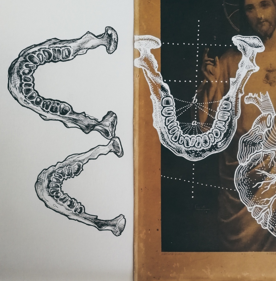
Medical illustration sketches – upper and lower jaw
Corpus Christi by Tiina Lilja – work in progress, detail of the human heart
medical illustration sketches by Tiina Lilja
The theme of this piece came straight out of my latest sketchbook: I have been obsessing over bygone medical illustration for some time and wanted to combine anatomical motifs with vintage style floral patterns – this picture with its dark background felt like the perfect backdrop to explore these ideas using white paint markers. By dividing the image into three separate fields using two circles drawn on top one another, I managed to create a sense of structure within a fairly straightforward composition as well as in painting a distinct decorative backdrop for my two main subjects, Madonna and Child and a line drawing of a human heart.
With all of these elements completed in white, I used spray varnish to isolate my drawn layer and used thin washes of oil paint to add colour on top of it. It took me a bit of going back and forth before I was completely happy with the results, but I was able to achieve a good contrast of white and coloured drawn elements by alternating between white paint markers, varnish and oil paint. Once the drawing was completed, now a mixture of tinted line work and thicker outlines in pure white, I chose to cover all voids in my background with a simple mint green-to-teal gradient. This made the painting appear more complete and allowed the tinted lines of the lilies merge in with the gilding of the wooden frame.
Lilium Candidum by Tiina Lilja 2019, mixed media on board
Lilium Candidum by Tiina Lilja 2019, detail
All and all, a happy little repaint job. What a shame it took me so long to get it finished after months of gathering dust in the studio!
Named after a white lily, also known as the Lily of the Virgin Mary, Lilium Candidum will be the last one of the Toussaints… for now. Although, I am off to France for a well-earned summer holiday in a week or two and who knows what I find rummaging through the brocantes and depots-vente by the foot of the Montagne Noire!
Having spent some time with my Double Exposure-project and learned a bit of printmaking, I am now back in the atelier, working to finish my portrait of the two brides from the 1930’s. Although I initially enjoyed working on people and costumes again, one detail kept giving me nightmares: the second bride had a really unpleasant face. Compared to a pretty successful portrait of the left hand figure, this one seemed both incomplete and overworked at the same time, making the whole painting feel unbalanced. Now, I am not one to give up lightly, but having tried improving this face several times without significant success there was only one thing for it: paint it over and start again.
Two Brides by Tiina Lilja – work in progress, detail
Two Brides, work in progress by Tiina Lilja – details of the old face before repainting
So, following a bit of doubt and self-pity, this is exactly what I proceeded to do… and boy I wish I had done it sooner! Some weeks have passed since I got rid of the old face – when covering up large details with oil paint you must be careful about allowing adequate drying time, and I am now making great progress with this piece. The new face is just how I wanted it: calm and soft featured, the perfect counterpart to my first figure whose confident form has hardly changed since I began the painting.
It is never easy to start again, having admitted defeat, even when you are confident about being able to turn things around. I was terrified the old face was the best I could achieve and that kept me from making any radical changes for a long time. Ultimately, if everyone was this terrified of failure, there would be not be a Guernica, or Sistine Chapel… no Jimson Weed. True failure is not about ability or achievement at all – it is what you choose to carry with you when moving on from an adversary event. In a society where an instant reward is expected to follow the slightest of efforts, it is natural to consider the absolutes of failure or victory as the only acceptable outcomes regarding work, education or personal development. In reality, there is a huge and productive grey area between the two.
Two Brides by Tiina Lilja – work in progress, detail
Two Brides, work in progress by Tiina Lilja – after repainting one of the faces
If I would only stick to painting what I know well my work would be pretty dull. I paint high end goods for a luxury market so the pieces I put forward must be of a good standard, consistently. This does not mean, however, avoiding challenging myself or aiming to create pieces that are merely good enough rather than good. The world of fine art can be fickle; trends fly by and what constitutes as good varies from person to person. The only way I can be confident about my work is to paint to a standard where I am happy with everything, first and foremost.
Two Brides, work in progress by Tiina Lilja
Two Brides, work in progress by Tiina Lilja – adding small details
Two Brides, work in progress by Tiina Lilja
There is still a bit to go before Two Brides is finished, but I am on the right track again. Being at peace with the faces, I feel optimistic about cracking on with other important details. Today I am particularly excited about the pearl embellished head-dress of the first bride and the second ones capped veil – small details that are suddenly very visible without the distraction of that awful face.
Printmaking is like sex – it’s not solely about reproduction.
It had been ten years since my last etching when I entered Frome Printmakers to begin a Hard Ground Etching course run by Steve Clarkson, the current chair of their studio-collective and a true printmaking wizard. The man is an expert not just in traditional printmaking, but he exceeds in digital image creation and knows more about obsolete photography techniques than any other living person on this earth… so, yes, I was incredibly intimidated.
Not for long though – as luck would have it, Steve turned out to be a wonderful teacher and a really nice guy.
teeth drawing by Tiina Lilja
human leg bone sketch by Tiina Lilja
Despite of knowing how to make etchings in previous life, I needed a bit of handholding to start with: Preparing a copper plate for an etching is by no means difficult, but you do need to know what you are doing. In the end, we prepared two plates with hard ground wax; the first one which I covered in drawings of the human leg bones and another featuring a single molar tooth. Both were submerged in a mild acid solution to etch my drawing permanently into the copper.
Ironically, it turned out much more fiendish to decide what type of prints I would like to make using these plates. Picking out a colour was tricky enough, but I quickly learned choosing the right paper and an appropriate print-to-paper ratio was equally important – perhaps even more impactful than colour alone.
copper etching plate
copper etching plate with ink
tooth etching and copper plate by Tiina Lilja
And please allow me to toot my own horn a bit here: my imagery, inspired by anatomical illustrations of a bygone age, worked silly well as etchings! Like establishing a missing link between my painted work and the all that drawing confined on the pages of my sketchbooks, re-learning printmaking has done wonders to my confidence as a visual artist. It is a pity it took me ten years to get back on it.
human leg bones etching by Tiina Lilja
tooth etching by Tiina Lilja in black and orange
leg bones etching by Tiina Lilja
I chose to print my plates on large sheets of handmade paper speckled with dark brown seeds. This was the paper stock that worked best with the line-work, giving me high saturation of ink each time, but it also chimed in with my concept of drawing something that would look at home on weathered pages of an old encyclopaedia. Printing on a unique paper like this added another layer of texture to my small edition of etchings, but it also meant small imperfections would be less noticeable if not complimentary on the final images.
That, my friends, is not a bad thing at all when you are still getting comfortable with print-works.
tooth etching by Tiina Lilja in black and orange
human leg bones etching by Tiina Lilja
What remains now, is the gargantuan task of choosing the right frames to display these bad boys… So if you know a good framers shop around Wells, give me a shout! My new prints deserve nothing short of the best, LOL.
We all have hobbies, right? Little bit of arts and crafts perhaps, going to the gym, cookery, those sort of things. I personally enjoy long walks with my Alsatian Rusty, running… and reading about the many ways the human body has been mutilated in the name of science. Strictly historically speaking.
Trust me, I am an artist.
All I can say in my defence is that it started with anatomy. As a painter occupied with the obsolete and the ostentatious, I was preordained to find illustrated atlases of the human body fascinating. The hyper detailed drawings of internal organs next to skeletons posed like marble statues of ancient Rome; what a delightful combination of the macabre and the medical! I tried to envisage what it must have been like, in the early days of scientific surgery and the golden age of dissection, to depict a body like this – to maintain a clinical gaze in the most intimate of situations.
medical illustration sketches – teeth
image from the Sick Rose
Medical illustration sketches – upper and lower jaw
The history of dissecting cadavers is a murky one, entangled in the stories of the resurrection men, unscrupulous surgeons, stolen bodies and desecrated graves. Having lived in Edinburgh, I could not avoid the ghoulish tale of William Burke and William Hare, a pair of friends turned murderers, who found a way to cash in on the lucrative body trade. They were caught and punished, Burke ending up at the business end of a long rope with a sudden stop. To add insult to injury, he was then publically dissected and his articulated skeleton was put on displayed at the Anatomy Museum at the University of Edinburgh where it remains to this day, alongside leather wallets made from his skin. Interestingly, but not entirely surprisingly, Dr. Robert Knox who had paid for the victims suspiciously fresh corpses was vilified, but otherwise free to move on with his life.
Dr. Knox’s involvement in the corpse trade was by no means unusual: for him and his contemporaries, stolen remains were an unsavoury, but a necessary part of studying the human anatomy. Before the passing of the Anatomy Act of 1832, bodies available to dissection were scarce, limited to those of executed criminals. However, through a bizarre loophole in the law, stealing bodies was not illegal as long as the resurrectionist would not take the deceased’s clothing or grave goods. Being poor highly increased your changes at ending up on the surgeons slab, but the wealthy did not entirely escape this gruesome faith either. The fear of dissection was so great that graves were topped with heavy stone slabs, anti-robbing “cages” made of thick iron or simply guarded for a fortnight or so following a burial. Alas, through sheer perseverance and widespread bribing of the officials responsible of safeguarding the sanctity of burials, the practice of bodysnatching continued until the 1832 Anatomy Act. The new law allowed the unclaimed bodies of the poor or those who had died in public institutions such as poorhouses, asylums or hospitals to be dissected by medical students; a model adopted from France where the staff at the public teaching hospitals were free to study anyone who had perished under their care.
From the anatomy of the human gravid uterus exhibited in figures, by William Hunter.
If like me, you enjoy browsing through books on Georgian and early-Victorian era medical illustration, take a minute to contemplate on the contributions of those anonymous dead who are immortalised in these beautifully morbid images. A corpse of a small child stands next to no chance to have been acquired through any other than unscrupulous means as were the bodies of pregnant women, the simple reason being that visibly pregnant women were not hanged for the sake of public decency. The Anatomy of the Human Gravid Uterus Exhibited in Figures by the famous anatomist William Hunter is a truly exquisite collaboration between a scientist and an artist, aided by the craftsmen who produced it in print, but there is little doubt that the women cut up and featured as anatomical specimen were anything but stolen from their graves.
Corpus Christi by Tiina Lilja – work in progress, detail of the human heart
Corpus Christi by Tiina Lilja – work in progress, jaw bones
Corpus Christi by Tiina Lilja – work in progress
Corpus Christi by Tiina Lilja – work in progress, bones of the foot
As a painter, this is a legacy that I too must acknowledge if I choose to make work inspired by early anatomical illustration. Choosing to talk about the underside of this age of medical history does not mean I am opposed to dissection of cadavers in any way. I am simply presenting this argument as it directly inspired me to create the latest piece in my “Toussaints” series called “Corpus Christi”; a small mixed media piece, mere 19×27.5cm in size, consisting of a 1930’s lithograph of Jesus Christ layered with drawn anatomical motives in white ink and varnish. “Corpus Christi”, literally thebody of Christ, felt like the only name to give to a piece combining vintage style medical illustration and religious iconography.
While working on this piece I came across a quote from Richard Barnet’s delightful Sick Rose (or Disease and the Art of Medical Illustration), describing the body disenchanted through the advances in modern medicine, surgery in particular:
“No timeless mysteries, only temporary ignorance, no vital force or soul, only an endless dance of enzymes and substrates.”
(Thames and Hudson, 2014, pg. 22)
As I have previously explained in relation to my usage of Christian imagery, disenchantment is indeed a good word to use when it comes to my personal relationship with God. I am not a believer and although raised attending church I have no faith. I hypothesise that once my life comes to an end there are no pearly gates for me; no salvation nor hell. Simply, nothingness. Denying the prospect of an afterlife does make me fear death – on the contrary. Naturally, this world view influences my work. By choosing to juxtapose the spiritual with the corporal in “Corpus Christi”, I aim to evoke the “vanitas” paintings of the past and the long tradition of “Memento Mori” imagery. Dust to dust, and so forth. For me, remembering death is a part of accepting death and making peace with it – seeing death as natural as life itself.
Corpus Christi by Tiina Lilja 2019, mixed media on paper – detail
Corpus Christi by Tiina Lilja 2019, mixed media on paper
Beyond “Corpus Christi”, I have been drawing a lot lately, continuing my “Double Exposure” project. (More about that in a bit.) If you fancy reading more about the history of medical illustration or surgery, I warmly recommend the writings of aforementioned Richard Barnet. Or check out the “Iconic Corpse”-series by Caitlin Daugherty on youtube if you are simply feeling a bit morbid – the one about Hayden’s head is particularly… well, funny.
Until next time.
Tiina x
P.S. I could not fit this in anywhere on this blog, but check this out. I would take anything coming out of Diego Rivera with a pinch of salt, but WOW.
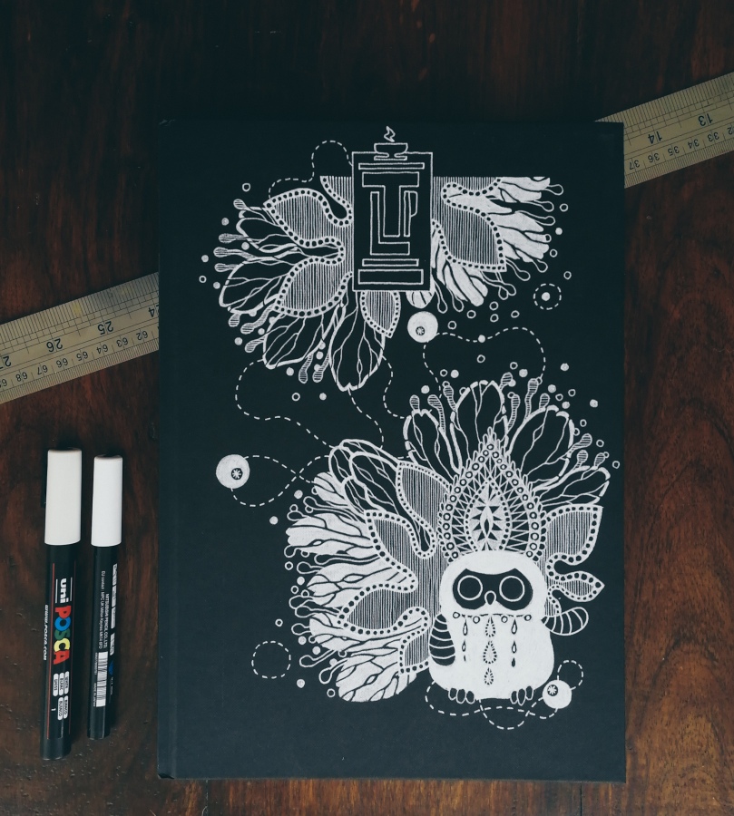
Here’s something that is bringing me joy this week: a brand new combine harvester sketchbook!
This one is the 23rd of its kind.
I bought my first sketchbook relatively late, back in August 2010 when I began studying painting at the Edinburgh College of Art. I had always drawn, but in a very goal oriented manner; sketching or any type of visual record keeping felt pointless if not simply antiquated. The head of first year students strongly disagreed, however. He wasted no time pointing out to us, a nervous herd of freshly baked art students huddled in one of the imposing Edwardian painting studios, how we were all missing one of the most important tools of our future trade: a sketchbook. “An artist should carry one at all times”, he proclaimed. Many people rushed to the college shop to buy one that afternoon, including yours truly. From their large selection of different types of sketchbooks, notebooks and pocket-journals, I picked a simple A4 sketchbook, portrait format, with 80 natural white pages bound in black cloth, and I have never looked back.
could this be my new sketchbook?
seawhite of brighton sketchbooks and posca markers
sketchbook number 23 by Tiina Lilja – cover art in progress
sketchbook number 23 by Tiina Lilja – cover art
sketchbook number 23 by Tiina Lilja – detail
sketchbook number 23 by Tiina Lilja – detail
If you do the quick math, the average time I have spent with each book since that August long ago is around four months. In reality I have devoted anything from three weeks to almost a year to a single sketchbook, depending on the type of project I am working on. At times I draw solely to work out a composition or to try out a new idea, but more often than not, the pages of my books are filled with idle doodles and random notes. Sketching is something that has taught me the value of drawing for leisure and shaped my identity as a painter. Like a mother, I am proud of these volumes and I guard them jealously. They are more important to me than any piece I have painted which is why I am far more uncomfortable about sharing them with the world beyond a few carefully chosen and decisively cropped highlights I post online every now and then.
sketchbook cover art by Tiina Lilja
sketchbook cover art by Tiina Lilja
sketchbook cover art by Tiina Lilja
sketchbook cover art by Tiina Lilja
Throughout the years I have tried out a few different brands, always returning to Seawhite of Brighton for their durability and great value for money. This company made the Edinburgh College of Art-stamped sketchbooks sold at my university art shop and thus ended up being my go-to-sketchbook manufacturer. I am not being compensated to advertise them to you – I wish I was, but I am not. It is simply what I prefer. On the flip side, the only brand I avoid is Canson, not because I would not like the quality of their wears, but because their A4 format is slightly stumpier than the one I am used to and I like my sketchbooks to be uniform in size.
Sketchbook number 23 by Tiina Lilja
Each book I have has a unique cover, drawn with white acrylic markers, those white gel pens or Tippex. Well, each but the very first, that one I rushed to buy in the beginning of my fine arts course. That particular sketchbook was stolen from my studio in ECA, which is why I started customising the covers in the first place – to make it easier to spot if someone was trying to walk away with my book. After all, every student was encouraged to have a sketchbook and most of them were exactly alike. All my covers carry a monogram and most are graced by a wee toy owl…, because why not. The rest depends on my mood on the day I crack on a new book and the stuff I happen to be working on. For example, one of my past book covers features a flying Volvo simply because I was painting portraits of my dad’s cars at the time. The 23rd cover is in turn purely decorative and, at least in my opinion, one of my better ones. Covered in stylised flowers in full bloom, it has the perfect motif for a spring sketchbook.