Proximity

Proximity /prɒkˈsɪmɪti/
noun

nearness in space, time, or relationship.

"Proximity" by Tiina Lilja (2020) embroidery and oil paint on board
“Proximity” by Tiina Lilja (2020) embroidery and oil paint on board

I’ve had some great news last Thursday: I’m finally going to be off furlough and back to work as a studio painter.  It has been a privilege to dedicate this much time for making my own art, but to be completely honest, I am really keen on returning to a form of normal in September.

Unlike my husband who has been working from home throughout and following lockdown, I have needed to set my own challenges during the Covid-19 crisis.  I would definitely say I was in a bit of a creative slump before the pandemic and the only way to move forward towards the new normal was to change the way I make art.  Focussing only on the positives, the last several months have made me more confident in exploring new ways of making visual art as well as tackling more overtly personal subject matter than ever before.  The first of these experiments, begun in early spring and finished in late July, is Proximity: a piece about my father who I haven’t been able to see since last summer.

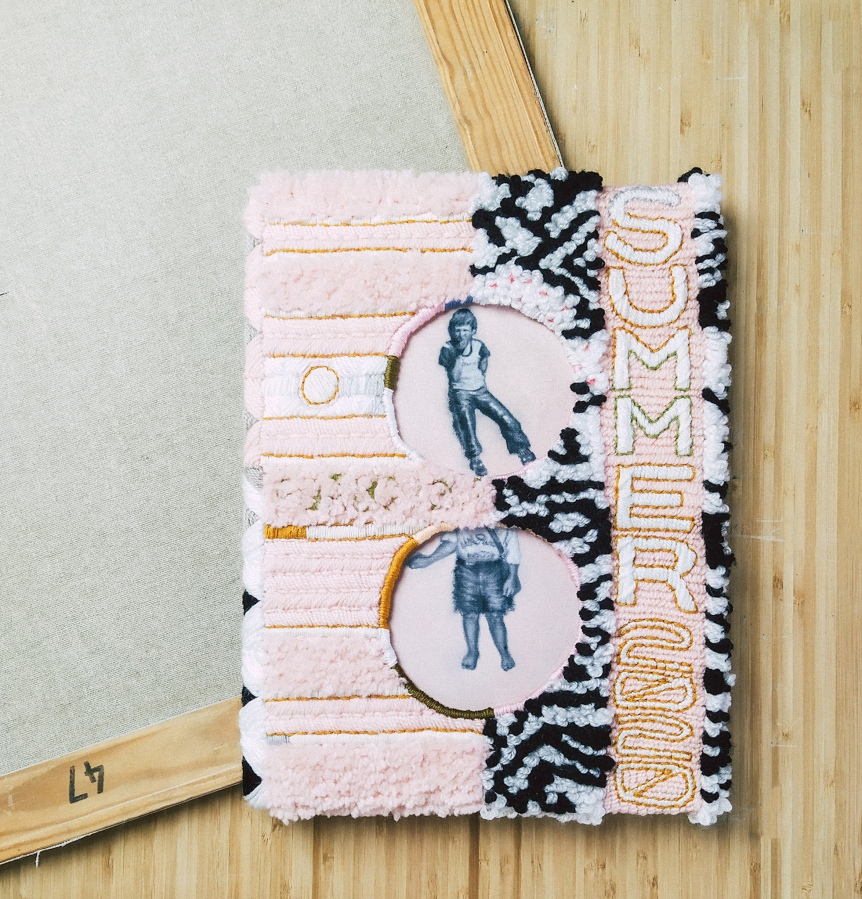
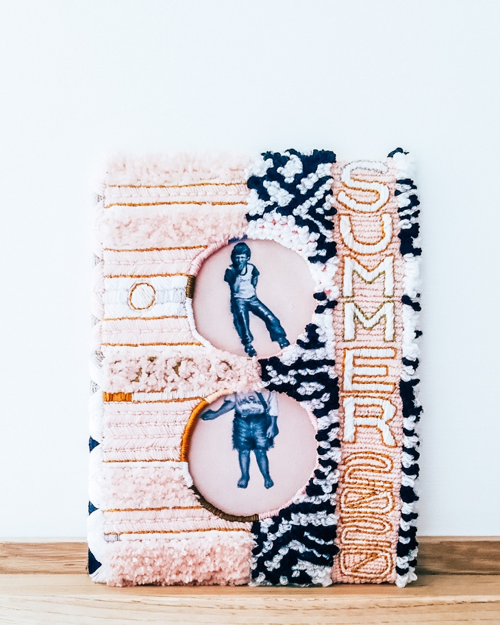
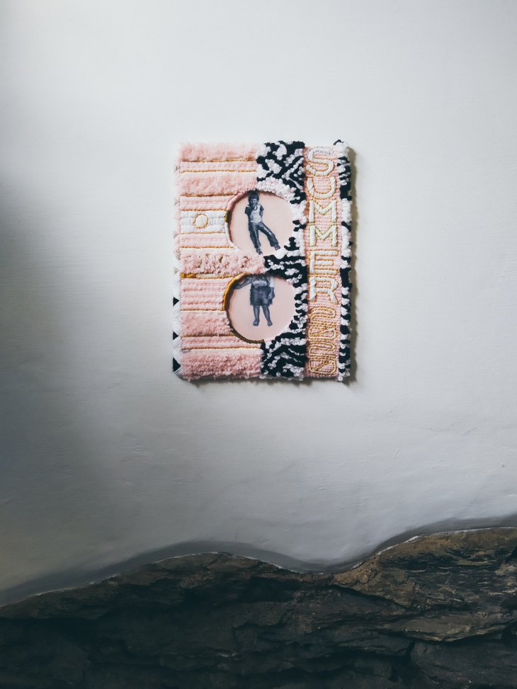
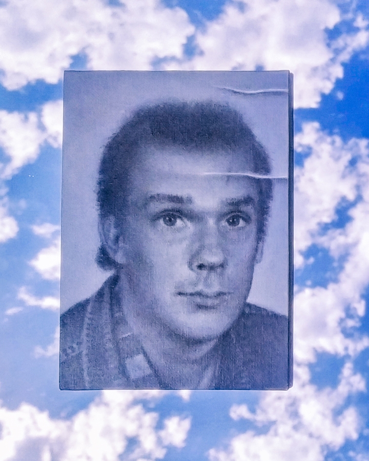
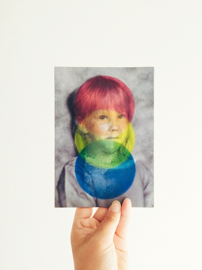
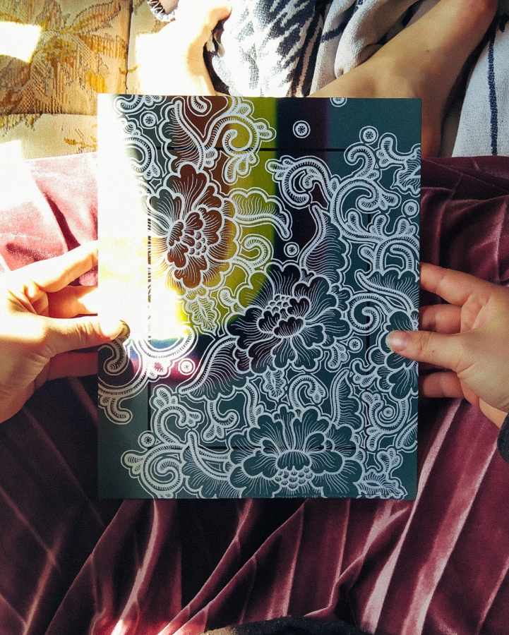
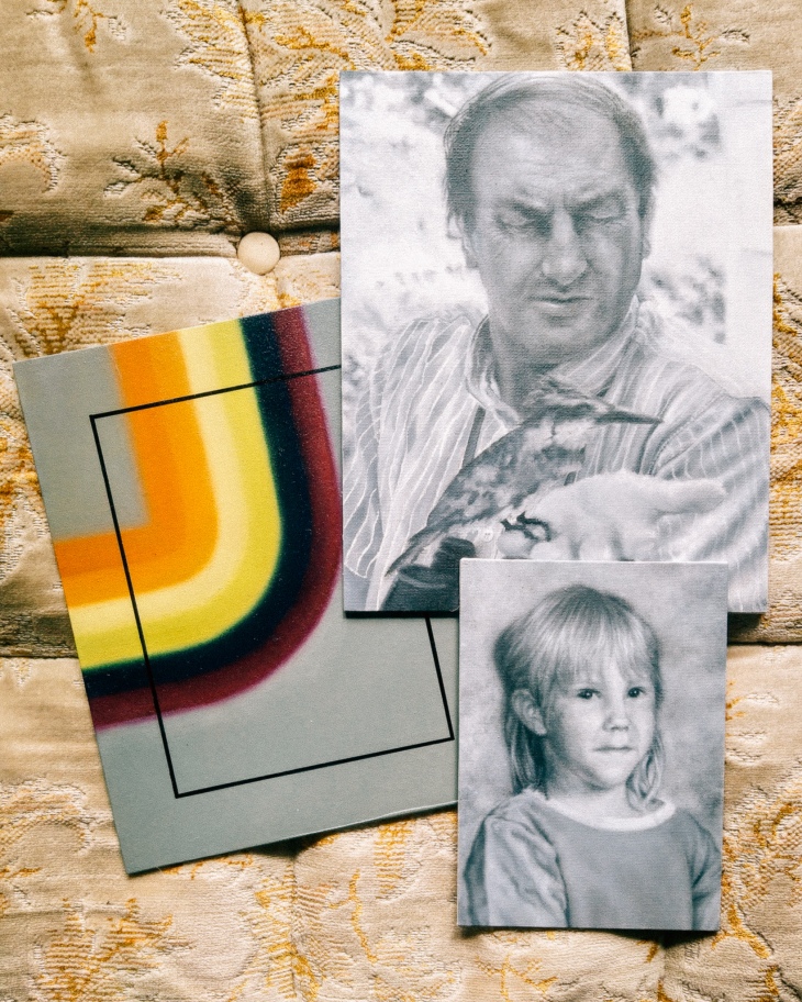
Proximity is a mixed media piece, slightly larger than an A4 sheet of paper, combining two oil painted miniatures sitting within an embroidered frame.  The portraits, one featuring a young boy around the age of 7 and the other of a slightly younger girl with her head cropped out, are those of my father and me.  In the photographs my painted portraits are based on, we are wearing the same pair of tasselled leather trousers, although by the time I had the honour of doing so, nearly 25 years ago now, they had been cut into shorts.

The reason Proximity took so long to finish was largely due to my indecisiveness.  Having finished the embroidered cover, largely using cotton thread and acrylic yarn, I simply could not choose what I wanted to paint.  Overtly Covid-centred subjects would have felt false – I am not that type of an artist and everything else seemed too mundane.  I left Finland over ten years ago now, but I have never felt this far away from home before.  Of all the things I have missed during lockdown: family, friends and my home in France… it was my dad Juha who I missed the most.  He’s a typical Finnish bloke, not the type to video chat or hang around social media and I have really cherished our long phone calls during this difficult time.

For better or for worse, Proximity is my main lockdown piece.  I have already improved on some of the ideas I first explored with this piece; others I have completely abandoned for now, but it shall always have a special place among my artworks.  I turned thirty just a week ago and the most important thing I am trying to implement, having reached this milestone, is to spend less energy on worrying about what other people think of me.  I lost quite a few followers off my Instagram when I started posting images of these types of mixed media- and textile pieces, but I’ve gained new ones since.  Life is too short to obsess over social media, and not worth living if you are just going to regret every risk and change of direction.

"Proximity" by Tiina Lilja (2020) embroidery and oil paint on board

So: take risks, create and don’t lose sight of the things that matter the most – that’s the new normal public service announcement from me to you.

Tiina x

Smoke and Mirrors

Hi guys, here’s a quick one – a wee social media gimmick I commandeered recently:

It’s not all just smoke and mirrors you know!

Actually, that’s exactly what it is.

Easy trick to get an interesting background for your instagrams...

Literally, all you need is a mirror….

…and a camera, I suppose.

Easy mirror trick for a neat instagram background for "1986" by Tiina Lilja

Works for video or photos, but you may want to wait for pleasant weather.  Between this still and my video, the sun was up and my wee insta clip wasn’t quite as nice as the photo, but here we are.  ¯\_(ツ)_/¯  I have been on a lookout for new ways to present my work and this trick looked really nice.  Well, I’d say that, wouldn’t I, but what do you think?

I got a few blogs lined up for you in a bit, an announcement and a bit of new work, but that’s going to need to wait until I’m done celebrating my 30th birthday.

Till then, keep calm and create!

Txxx

A word with the Micromanager

Anybody else struggling with motivation lately?

Seems like this is all I talk about these days; I am not really built for the anxieties of the new normal.  Where I tend to be pretty good at setting my own goals and sticking by them, lately the uncertainty with work and life in general has really started to affect my productivity.  Add in a generous helping of self-doubt and you end up with this hard-to-shake feeling of existential dread.

Not the best of times to revisit a finished artwork, I know, but here we are.  Remember “1997” – I wrote a blog about the meaning behind the picture some weeks back and logged it as finished on my studio inventory.  Case closed.  Yet I have not stopped thinking about the wee thing.  It is a piece that means a lot to me, being a sort of self-portrait and all, but I kept thinking it should somehow be… well, better.

This is by no means the first time I have started again: just last summer I completely repainted one of the faces in Two Brides.  It was a calculated risk that paid off, but not an easy decision to make at the time.  The materials I work with, mostly oil- and acrylic paints, are non-reversible.  They can be removed using solvents or brute force for sure, but generally speaking you cannot restore areas that are overpainted once the paint has dried.  A strict one-way system of sorts.  The reason a conservator would use specialist pigments in restorative overpainting is so that their work can be safely removed when necessary.  As an artist however, a maker of things, this is not a practical way to build artworks.

Personally, I thought the multi-coloured elements I added on top of the black and white portrait in 1997 were a bit heavy handed.  I did not want to remove this layer fully, but rather integrate it better with the portrait underneath, by making areas on the face more translucent.  I could have added more paint, or sanded down parts of the coloured top layer, but I opted out for a riskier strategy of a solvent, turpentine to be precise.  The main reason I felt this painting was not working previously, was the dull precision of its parts, making it all too uniform for my taste.  By choosing to remove some paint in this unpredictable way, I managed to re-introduce character that I felt was previously lost.

I am really pleased how it turned out, but again it was not a decision I took lightly.  At the end of the day, any artist is responsible for their own quality control.  Is this piece sign-off quality?  Could I be displeased about it simply because I feel down about most of my work just now?  Is the time used reworking this piece time/money well spent?  Question yourself before taking steps that are irreversible.  Measure twice, cut once etc.

If you need to think whether an artwork is finished, it probably is not.  Conversely, there is a fine line between sensible quality control and micromanagement.  You can set any picture (or a problem) aside and return to it when you are feeling better/more confident/re-inspired.

Or simply, ask a friend – if there’s one thing I have learned from the Covid-19 crisis it is that we’re all in this shite together.

Pumpuli Enkeli

Can I withhold pay if my studio assistant refuses to social-distance himself?

My studio assistance refuses to social distance himself.

Greetings from the atelier floor – I’ve got something to show to you and I swear it is more than just adorable photos of my dog.  The rainbow-hued mixed media piece that cropped up on this blog last week is finally finished.  Now named “Pumpuli Enkeli”, it started out as a simple test in blending, on a slightly defective canvas panel.  It is quite rare that I have time to experiment beyond doodling on the pages of my sketchbook, so this has been a real treat.

Long story short: I wanted to see if it would be possible to use acrylic paint markers on top of an oil painting.  Usually you’d expect some rejection, but it has turned out much better than first predicted.  I used spray-on picture varnish as a blocker between the oil-painted basecoat before adding the line work using acrylic paint markers.  A few days later, further two coats of picture varnish were added to protect the finished surface and give this artwork an even sheen.

Only time will tell how it will age, but so far so good.

colourful calico painting by Tiina Lilja

I have been drawing a lot of floral patterns lately, inspired by one of my favourite books: Owen Jones’ the Grammar of Ornament as well as his the Grammar of Chinese Ornament.  Yet it wasn’t Mr. Jones who turned me into a connoisseur of printed cottons.  I grew up in a historic textile town of Forssa, in the South West of Finland, so you could say the love of pattern is in my blood.  The name Pumpuli Enkeli translates as the Cotton Angel – a nickname of the factory girls of Forssa who worked in the Finlayson textile mills.  This is the official version anyway, sanitised by the passage of time.  Some old beards who worked down at the mill as lads in the beginning of the 20th century, however, recalled a cruder alternative in a documentary I saw years ago: Cotton C*nts.

Fair enough.

Angels or not, this painting is my tribute to those largely nameless girls and women who shaped Forssa into The City of Colourful Cloth.

The history of my hometown has inspired me to a great extent and I cannot deny the influence Finnish design has had on my work.  There are many artists and designers I feel indebted to, with special thanks given to Aini Vaari, who drew patterns for Finlayson in the 1950’s and 60’s.  My painting “1958”, featuring her Coronna-design as a background motif, continues to be one of my own favourites.

At the time I was obsessed about mid-century Americana in Scandinavian graphic design, such as the Boston cigarettes pack featured in my painting.  It is modelled on a real pack of fags given to me by my builder dad, who had found it under a floor on one of his job sites.  Either left behind by accident in the late 50’s or placed there to amuse renovators of the future, the dinky cigarette case was all crinkled up, but as vibrant in colour as on the day it was printed.

"1958"

Oddly enough, the other paintings I am currently working on, too, remind me of home.  Most of these pocket sized portraits feature my immediate family back in Finland.  Although I have lived overseas for ten years and a bit, it is this pandemic that makes me feel light years away from them.  Tracing the likeness of my dad or my wee sister makes me feel that little bit closer to them when the world seems to be going down the toilet.

But enough of that negativity already.  I should be back at my 9-5 in a few weeks’ time, fingers crossed, and in the meantime I have a studio full of paintings to finish.

So happy painting!

Tx

Work in Progress

I don’t know about you, but I am really struggling to get anything finished these days.

So, in the spirit of keeping calm and carrying on, I thought I’d give you a few work-in progress-snaps.  Y’know, in case you too are browsing the underbelly of internet rather than getting back to work.  I would know… after all, I am writing this to actively avoid getting any painting done.

Lots of little paintings needing to be finished in my studio

As you can see, my little family of portraits is steadily growing and I do promise to get on with it all.

Tomorrow, maybe.

In general, I do find working on multiple paintings pretty useful.  Mainly, as it stops me from getting bored of my own work.  Also, when using oil paints, this will give you something dry enough to paint on each day.  That is the theory anyway.  Right now I have a studio full of little paintings, like a closet full of clothes and nothing to wear.

The latest additions are my wee sister (left) and me (right), captured around 1996-1997 or so, and my husband’s dad (centre).  I never got to meet John, which makes rendering a likeness quite difficult, but we are getting there.  Painting a portrait from a photograph alone can be a bit tricky, but luckily I have my hubby to guide me through it.  As silly as it sounds, sometimes you can paint the most perfect copy of a photograph, yet as a portrait it looks nothing like the person photographed.  This wasn’t a problem when I was painting my dad, for example, as I know his features better than my own.  I loved being able to spot any rogue brush strokes immediately, but here I am not quite so sure of myself.

We’ll just going to have to wait and see how this portrait develops.

The other thing I’ve been working on is the vibrant rainbow swirl pictured above.  It started out as a colour test for another project, really, but could mature into a piece of its own.  I am currently waiting for the paint to dry on this one so I could start adding new elements on top of the oil painted base-layer.

So stay tuned – how long can it take to find inspiration locked in a small cottage in the middle of a pandemic?  Right!?

Oh, and allow me to toot my own horn a bit.  If you fancy more of these work in progress type of posts, head over to my Instagram;  you’ll get your fix there.

Cheerio.

Tx

Life on lockdown

Greetings from lockdown!  For better or for worse, I suddenly have tons of time on my hands whereas the past six months or so have practically flown by.

Unlike many creative industry professionals, especially those reliant on freelance work to survive, I am able to sit back and wait for better times in relative comfort.  If you happen to be as lucky as I am, please go and check out the Artist Support Pledge on Instagram.  The scheme is simple: artists offer their works to be sold for 200 pounds or less and commit to purchasing work from another artist once they’ve reached 1000 pounds in sales, hopefully keeping themselves and their fellow makers afloat through these uncertain times.  From a buyer’s perspective, the pledge is more than an act of charity: these artworks range from unique pieces to artist’s proofs, limited edition prints and sketches that might not otherwise be on the market.  Opportunities to browse such a large collection of artworks is rare and this might just be your change to become an art collector from the comfort of your own home.

So go on, treat yourself to a browse on #artistsupportpledge

But back to the blog:  I have been practising portrait painting.  No sitter would voluntarily enter my home studio/man-cave so I picked out my favourite family photos and started sketching.  These are all small oil paintings on canvas panels and I am hoping to finish quite a few before I’ll be back to my 9 to 5.  The one I would like to share with you is my dad Juha, circa 1986 and the first of these dinky portraits I have finished since I was furloughed.

Juha - work in progress

The reason I chose to go with canvas panels rather than stretched canvas was simple: they are affordable, easy to store, ship and frame and altogether more straightforward to work with when you are chronically short of space.  Now, I wouldn’t use these for anything bigger than an A4 as they have a tendency to warp, but the ones I am currently using are no bigger than 8×10 inches.  They arrived pre-primed, but I chose to add an additional layer of gesso anyway.  More the merrier, I say and I like to cover all pencil marks under a thin layer of primer to stop the graphite from mixing with the paint I use.  This will also help with the coverage, if like me, you prefer a strong pencil sketch to guide your brush.

Juha - work in progress

"1986" (Juha), by Tiina Lilja (2020), oil on board
“1986” (Juha), by Tiina Lilja (2020), oil on board

All and all, I was really happy how this monochrome little portrait turned out.  Obviously, my dad was chuffed to bits too.  That’s really all I want to achieve with these pieces, besides from keeping myself busy for the next few weeks to come.  If you got any juicy lockdown tips, work from home stories etc. let me know in the comments.  I’m not saying that I am slowly being driven round the bend by the sound of my husband breathing and whatnot, but y’know.

Otherwise, keep calm and paint on.

Tiina x

Two Brides

I have written a bit about the Two Brides before, first focussing on the element of painting a figurative portrait with the aid of photography and latterly to discuss the concept of failure as a creative practitioner.  This time, however, the piece is no longer a work in progress: I have indeed finished my first portrait of persons in nearly seven years.

Two Brides, painting by Tiina Lilja, oil on canvas (2019)

If you are a regular reader of my wee blog or you found yourself here via Instagram, I imagine you to be pretty familiar with Two Brides already.  I sketched out the foundations for this artwork in January 2019 and having moved house and struggled with achieving what I considered a good enough likeness, I worked on it in little bits until I was happy with the costumes, background and, of course, the identifying features of the faces and hands of my two subjects.  This one is a fairly classical composition, drawing heavily on the look of the 1930’s studio photography this piece was directly drawn from.  Inspired loosely by the drawing Three Brides by Jan Toorop, a Dutch-Javanese symbolist, and the zeitgeist of the period between the two world wars, Two Brides was an interesting piece to execute from start to finish.

de-drie-bruiden-jan-toorop-53113-copyright-kroller-muller-museum.jpg
Three Brides by Jan Toorop via Kröller-Müller Museum

I feel any deeper analysis of my own work would be pure hubris, so this is where I will leave you, with my favourite work-in-progress shots of this painting and a promise to get back to you soon with news of new work!

P.S. Oh yes, and here’s a wee bonus: Seems like the Snapchat genderswap-filter does work on paintings too!  I hope you find these as funny as I do…

Voilà. 

T xxx

Lilium Candidum

It has been a while since I added to my Toussaints series, so I am pleased to introduce Lilium Candidum, the latest of these mixed media pieces based on/ up-cycled using early 20th century religious prints I have collected from the South of France.

The print of the Madonna and Child I started with was originally manufactured in Florence, as indicated by a small label still attached to the back of the piece.  Not that it came as a huge surprise – this picture with its heavy lacquer, the grandiose gilded frame and how it was mounted on wood, is a text-book example of mass produced Italian souvenirs.  My guess is that it is also not nearly as old as you might first think it is, dating anywhere between early 1960’s to 1980’s.  So not exactly a masterpiece of the Italian arts, but a perfect candidate for repainting.

Before beginning, though, I had to address some issues within the structure of this piece.  The lightweight wooden frame had a coating of plaster that was cracked in places and missing bits of paint.  Now, I would not take this approach with an antique frame, but the most cost effective way for me to stabilise it was to glue in any large chunks of plaster as well as loose paint and fill the voids with bog-standard wood filler.  Having waited for my repairs to dry I gave these spots a light sanding and touched up missing paint with my oil paints.  I had no desire to replace the missing gilding, but as the frame had been purposely distressed by the manufacturer, my repairs done with non-metallic paints were practically invisible anyway.

Lilium Candidum by Tiina Lilja - work in progress

The theme of this piece came straight out of my latest sketchbook:  I have been obsessing over bygone medical illustration for some time and wanted to combine anatomical motifs with vintage style floral patterns – this picture with its dark background felt like the perfect backdrop to explore these ideas using white paint markers.  By dividing the image into three separate fields using two circles drawn on top one another,  I managed to create a sense of structure within a fairly straightforward composition as well as in painting a distinct decorative backdrop for my two main subjects, Madonna and Child and a line drawing of a human heart.

Lilium Candidum by Tiina Lilja - work in progress

With all of these elements completed in white, I used spray varnish to isolate my drawn layer and used thin washes of oil paint to add colour on top of it.  It took me a bit of going back and forth before I was completely happy with the results, but I was able to achieve a good contrast of white and coloured drawn elements by alternating between white paint markers, varnish and oil paint.  Once the drawing was completed, now a mixture of tinted line work and thicker outlines in pure white, I chose to cover all voids in my background with a simple mint green-to-teal gradient.  This made the painting appear more complete and allowed the tinted lines of the lilies merge in with the gilding of the wooden frame.

Lilium Candidum painting by Tiina Lilja 2019

All and all, a happy little repaint job.  What a shame it took me so long to get it finished after months of gathering dust in the studio!

Named after a white lily, also known as the Lily of the Virgin Mary, Lilium Candidum will be the last one of the Toussaints… for now.  Although, I am off to France for a well-earned summer holiday in a week or two and who knows what I find rummaging through the brocantes and depots-vente by the foot of the Montagne Noire!

 À la prochaine!

Tiina x

If first you don’t succeed…

Having spent some time with my Double Exposure-project and learned a bit of printmaking, I am now back in the atelier, working to finish my portrait of the two brides from the 1930’s.  Although I initially enjoyed working on people and costumes again, one detail kept giving me nightmares: the second bride had a really unpleasant face.  Compared to a pretty successful portrait of the left hand figure, this one seemed both incomplete and overworked at the same time, making the whole painting feel unbalanced.  Now, I am not one to give up lightly, but having tried improving this face several times without significant success there was only one thing for it: paint it over and start again.

So, following a bit of doubt and self-pity, this is exactly what I proceeded to do… and boy I wish I had done it sooner!  Some weeks have passed since I got rid of the old face – when covering up large details with oil paint you must be careful about allowing adequate drying time, and I am now making great progress with this piece.  The new face is just how I wanted it: calm and soft featured, the perfect counterpart to my first figure whose confident form has hardly changed since I began the painting.

Two Brides, work in progress by Tiina Lilja - repainting a face with oil paints

It is never easy to start again, having admitted defeat, even when you are confident about being able to turn things around.  I was terrified the old face was the best I could achieve and that kept me from making any radical changes for a long time.  Ultimately, if everyone was this terrified of failure, there would be not be a Guernica, or Sistine Chapel… no Jimson Weed.  True failure is not about ability or achievement at all – it is what you choose to carry with you when moving on from an adversary event.  In a society where an instant reward is expected to follow the slightest of efforts, it is natural to consider the absolutes of failure or victory as the only acceptable outcomes regarding work, education or personal development.  In reality, there is a huge and productive grey area between the two.

If I would only stick to painting what I know well my work would be pretty dull.  I paint high end goods for a luxury market so the pieces I put forward must be of a good standard, consistently.  This does not mean, however, avoiding challenging myself or aiming to create pieces that are merely good enough rather than good.  The world of fine art can be fickle; trends fly by and what constitutes as good varies from person to person.  The only way I can be confident about my work is to paint to a standard where I am happy with everything, first and foremost.

There is still a bit to go before Two Brides is finished, but I am on the right track again.  Being at peace with the faces, I feel optimistic about cracking on with other important details.  Today I am particularly excited about the pearl embellished head-dress of the first bride and the second ones capped veil – small details that are suddenly very visible without the distraction of that awful face.

‘till next blog,

Tiina x

Radar Artist Fair

Back in the game, so to speak; I’ll be exhibiting at the Radar Artist Fair in the Old Spitalfields Market coming May!


Radar Artist Fair is an Artist Led platform to Amplify the Next Wave of Artistic Talents and Connect a Global Audience.  The Real affordable Artist Fair that’s affordable for Artists.   Artists taking back Control!

What’s not to like.

I have some great new pieces ready to go and others that will receive nifty new mounts just for the occasion.  So if you happen to be in London on the second weekend of May (10-12.5.19), come and say hi!