It’s been a weird few weeks so I hope you forgive me for not being desperately active on the blog lately. But I have been busy in the studio, trying to finish up my furlough paintings and working on some new embroideries. Even so, finding the motivation to make art has been a struggle. I surprised myself, really, when I positively leapt on a chance to take part in the Door to Door project organised by Art Aviso.

Da Vinci’s “Mona Lisa” from Newnes’ Pictorial Knowledge 1950’s Encyclopedia (Edited by Enid Blyton), the base of my Door to Door submission.
")
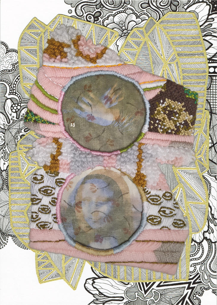
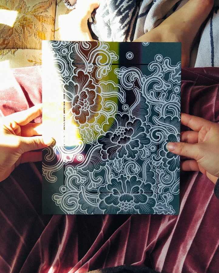
“This is probably the most famous picture in the world” by Tiina Lilja for Art Aviso Door to Door – Art in time of Covid-19 project. Mixed media on paper, (2020)
The concept is simple: Each participating artist will be supplied with a page from Newnes’ Pictorial Knowledge 1950’s Encyclopaedia selected at random, which will form a basis of an artwork to be exhibited at Lite HAUS Galerie, Berlin in September 2021 as well as joining the active, evolving Art Aviso Door to Door virtual exhibition. There’s still time to join in – Art Avisos Door to Door – Art in time of Covid-19 project is open to their subscribers based in UK and Europe.
I just finished submitting my artwork “This is probably the most famous picture in the world” , so how about a little “behind the scenes” tour?

Door to Door project by Tiina Lilja – work in progress. Here I have finished off my Mona Lisa photo transfers in two versions. In the end only two made it on the finished artwork.

The different versions for my “Door to Door” photo transfers. In the end I went with the low-contrast one, ironed on patterned cotton.

Door to Door contribution by Tiina Lilja – work in progress
Here’s how I wrote about my contribution:
If imitation really is the sincerest form of flattery, Da Vinci’s Mona Lisa is the finest portrait ever painted. Arguably the most famous picture in the world, she has earned her place among the most copied images too, through countless reproductions in books and in print, all the way to keyrings and tea-towels emblazoned with that mysterious smile.
Her entry in the Newnes’ Pictorial Encyclopaedia can be found in Volume 7, under Great painters of all Nations- How they lived and what they achieved, on page 13. She is iconic – and utterly untouchable. My work is very much concerned with icons and idols, but the only way I felt I could approach the Mona Lisa, was through her numerous copies, from the tastefully informative such as the black and white illustration on my allocated leaf, to the utterly absurd. A naughty Mona Lisa Halloween costume comes to mind as a good example of the latter sort.
With this in mind, I set out to embroider and draw around a set of photo transfers featuring digitally altered snippets of the page I was allocated. Beyond scaling everything to fit a sheet of A4 paper, I made no sketch or a plan for the piece as I wanted it to assume its shape organically. Like in a game of Chinese whispers, the end result is both reminiscent of its origin and removed from it. A nuanced smile.
As said, I was well chuffed about the project briefing: maybe my page was going to be an awesome medical illustration or an obsolete graph of some sort. What dropped in my inbox, however, was a black and white rendition of the most famous portrait ever painted: the Mona Lisa by Leonardo Da Vinci. I was not disappointed by any means; just a little lost at first. The Mona Lisa is not just one of the most recognisable images in the world, but also amongst the most copied. Any retelling of this image would immediately be compared not just to the page from Newnes’ Encyclopaedia, but to the thousands of other renditions of Da Vinci’s masterpiece.

Door to Door contribution by Tiina Lilja – work in progress

Art Avisos Door to Door project, work in progress
Faced with this dilemma, I decided to focus on the idea of reproduction through repetition rather than simply re-imagining this renaissance icon in 2020. Two snippets from my allocated page, digitally altered and cropped, became the core of my piece in form of photo transfers, ironed on patterned scraps of cotton. The rest was left to form freely around a sheet of A4 paper set out as the base for my work. As said previously, the process best resembled a game of Chinese whispers with an excitingly unpredictable end.

Door to Door contribution by Tiina Lilja – work in progress – with a sliver of that Mona Lisa smile

Sizing up my embroidered elements against a sheet of A4 card.

Door to Door contribution by Tiina Lilja – work in progress
Material wise, I thought it was important to stick with things I had in my studio at the time. Although I did have to purchase a can of mount spray, I was pleased how the colour scheme of the piece was influenced by other projects I am currently working on, rather than being pre-determined through deliberate design. I am a slave to habit and breaking out of my usual comfort zone of meticulous planning has truly been my favourite aspect of participating in this project.
If any of this floats your boat at all, pop over to the Door to Door exhibition page to see how other artists have re-interpreted their encyclopaedia pages.